
November 2026 update. I still want to move quickly, but I no longer measure progress by how many screens appear in a week. Reusing a tested section, a shared style rule, or an API contract can remove duplicate decisions. It does not remove the need to verify the result on the actual site.
When I ask an agent to help with an interface, I want a small reviewable change: what changed, which page it affects, whether keyboard and mobile behavior were checked, and what remains untested. That is a better speed-up than a large unreviewed rewrite. The startup lessons below describe the earlier motivation; this is how I would apply them to today's Antsand work.
I will tell you what I learnt trying to start a SaaS (Software as a Service) company. Back in the day, I created this small software to keep track of my travelling needs. I could take photos, write notes, upload them, and share them with friends and family. Over time it turned out to be like my online journal. When I joined Toastmasters to work on my public speaking and used this application to keep track of my public speaking. Record my speech and upload it online. Ask a few of my friends for feedback and as a result, keep improving. The application started to get noticed, many of my friends joined the portal. Many started to give feedback and we formed a small team. Venturing more into self-development, we started to form a mastermind group. We developed a section in this portal to cater to mastermind needs. All of this fit the realm of journaling and recording life activities.
As we started to get more involved with toastmasters, we wanted to extend this portal to help our peers journal. They could write on anything, like motivation, public speaking, inspiration and we would post it online like a blog. That was Antsand's journey: from a journal, to a place for our mastermind group, to a blogging portal. All the features that were designed since day one still exist. Just the use case is a bit different.
My peers said we kept pivoting. I did not see that as a failure. We were learning which use of the software people actually wanted. Changing direction helped, but each change still needed evidence that people would stay.
For Antsand, the change was concrete: the same note-taking and sharing tools found a different use when our Toastmasters peers began publishing. I can explain that decision from our own work rather than borrow a list of famous company origin stories.
As we started to help our local toastmaster club, we got quite a few users blogging on our portal. We even got 2 paid customers to use our service. But then it all stopped. What went wrong? What suddenly stopped the growth?
According to my peers, we did not validate the market. We did not talk to users to see if it fits the market needs. That is not the case. We did not get 60+ users joining our portal by magic. We spoke to a lot of people from Mexico to India to people in Canada. We asked what their needs were, we provided a solution and told them this is what we do. Would you be interested? And they gave it a try.
So what went wrong after those early signups? We could attract some people, but we struggled to keep them. That did not make market validation unimportant. It showed me that initial interest and continued use are different tests of a product.

Let me tell you why. Before I explain, let us go one step deeper into understanding what comprises of customer retention. I started looking at four practical questions: Viability, Usability, Speed and Reliability.
Viability: Does your idea solve a pain point or is it a solution to a need?
Reliability: How reliable is your product. Does it work smoothly; it does not crash?
Usability: How easy is it for users to navigate through you web page? Is it intuitive to use? IS it fun to use and does it look appealing enough for them to continue using it?
Speed: How fast is your application. Do users have to wait for your application to load?
On a scale of 1-10 this is how I rate how we faired against each of this:
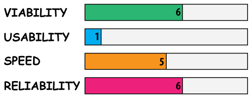
People had plenty of advice. I needed to compare it with what users were actually telling us and where they got stuck. My peers could not pinpoint the retention problem from a distance; the repeated questions in the product were more useful evidence. From that feedback, I suspected usability was our biggest weakness. All our customers were complaining along the lines of, How to use this? What does this button do? Why does this exist? Hmm, needs some improvements in design? All of their suggestions were related to usability.
If usability was costing us returning users, what could I change first?
I could hire a UI designer, but at the time I did not have the money. I decided to learn enough to improve the interface myself.
2. Learn usability and user interface and never have this issue again. I choose the latter. Sure it is going to take me some time to master the ART, but I am willing to be a student. I feel these skills are vital and will help me in the long run. I might burn a bit of time now, but I will be able to cover it up way faster in the future.
I would not rank idea validation below retention as a universal rule. For us, the early signups showed interest; the drop-off showed that interest was not enough. We had to make the product useful, reliable, understandable, and fast enough for people to return. A new idea would not fix a confusing interface by itself.
Secondly, mastering retention is like having a powerful system in place. Think of it as a black box. You can throw in an idea and it will produce the output. A retention black box must have a feedback system in place. The right testing process to fix issues quickly and not break the existing system, the right way of configuring user interface, the right process of doing A/B testing, a system for asking customer feedback and many other things. It should be able to work fast, make your system extremely reliable have the ability to constantly test its viability and most importantly a system to test usability. A good feedback-and-testing loop gives you a chance to fix what drives users away. Because you can fix issues and cater to most wanted feature or remove unwanted features quickly.
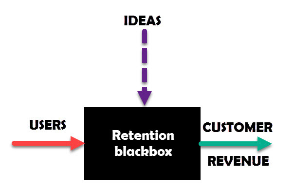
So how do you master the skill of retention? Our weakness is usability. So for the rest of this article, I will show you exactly what I am doing to master usability and user interface. The same habit of studying, building, and checking can help with reliability and speed, though each needs its own tests.
1. Study your competitor's usability and user interface.
2. Study from 1st principle understanding.
3. Learn to visualise everything in your mind. EVERYTHING
4. Work on live side projects to make the learning real.
5. Read a lot, absorb a lot, practice a lot and just enjoy the brutal pain of expanding on your skill.
6. Create a powerful system for UI
7. Learn what templates and libraries are doing before you depend on them.
1. Study your competitor's usability and user interface.
When you start a start-up, good chances are, part of your product, there is a market for it already. Study your competitors in those markets. It does not matter if you are in retail on starting an online business. You will always have competitors. They are your best teachers. For us, our competitors are Evernote, OneNote, conversionXl, just to name a few. In terms of creating a blog platform, it is Wix, canvas, unbounce, clickfunnel, Weebly, WordPress. In terms for metrics, mixpanel, zarget, hotjar, crazyeggs, mouseflow. In terms of outstanding blogs out there, our competitors are conversionxl, iwillteachyouhowtoberich, neilpatel, freedombusiness, markmanson, waitbutwhy, etc. STUDY ALL OF THEM. Join their platforms, use it, feel it, study it, be their customers for the sole purpose of learning. Take time to research on your competitors. They will guide you where you need to be if you are not there already. Now that I know what good user-interface looks and feels like, and how they expect their customers to use or read their work, it is now time to get all my concepts right and start implementing.
2. Study from 1st principle
This is a concept that I always lived by and Elon Musk is a very strong advocate of this idea. Learn fundamental truths of why things work rather than just making it work. Take time to understand concept deeply. Shallow learning will be your worst enemy when it comes to retaining customers. It is your in-depth knowledge and ability to solve problems quickly that will take you a long way. 1st principle understanding will help you build that ability. So how does this apply to learning usability and user interface? How am I applying these concepts? For me to understand what usability is, I need to ask very powerful questions:
What language do I need to master to bring good user interface into my app? CSS and javascript
How does CSS actually work?
How does changing one parameter in CSS affect the styles on the page?
How can I modularize my CSS?
What tools are out there to help me code in CSS better?
What do I need to learn to copy my competitors design and study them?
IF things do not work the way I expect them to, how should I debug the issue? Learn how to debug usability and user interface.
How does color influence user interface?
How does typography influence interface?
What typography is good for web?
What color helps users to stay on the site longer?
How to design a button? How to design a form?
How to design a flow of a webpage?
What tools can I use to create graphics?
How many clicks are ideal for a user to go from point A to point B?
How should the same site look on a mobile or on a tablet or on desktop?
Should you have drop-shadow or not?
The list of questions can go on and on. But asking the right question will deepen your understanding of the subject. You will not know all the answers all at once. And you should not. But constantly asking questions and figuring out ways to understand them will help you master the subject quicker.
3. Learn to visualise everything
Once you have asked questions, try to answer them yourself without looking for solutions. Get your mind start to think in design terms. Visualise the solution in your mind. How does it work? Why does it work the way it does? Visualise how one of your competitors designs you can incorporate into your app. How would it look? The whole idea of visualisation is to get your mind thinking deeply. The more vivid the information is in your mind, the faster you can make that invisible thought a part of reality. Today, I visualise user interface and see how it can fit into my app.
Resource: Psycho-cybernetics, Richard Feynman
4. Work on live projects to make the learning real.
You will only learn a lot by applying the concepts. That is very true. But apply from visualisation and not from copying or reading. The source of your information must come from your visual thinking. If you like a design used by your competitors, how are you going to implement it exactly? 1st you need to visualise how does the design work. Why does it work the way it does? Then visualise how you are going to code it. And when you start to design it, you will be creating an application that looks like your competitors but is using your design methodology. Let me give you an e.g. This is me trying to improve on the UI of my text editor.
Old antsand text editor
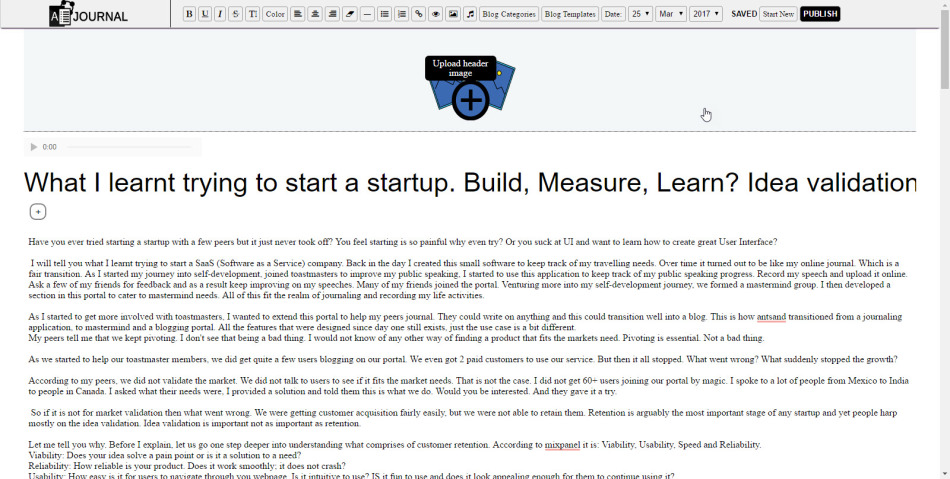
New editor Brand new Evernote lookalike

5. Read a lot, absorb a lot, practice a lot and just enjoy the brutal pain of expanding on your skill.
IF your pre-requisite in understanding web-technology is weak or for that matter any field you want to master, you will have to read a lot, practice a lot get your fundamentals strong. Don't try to skip a step to get something working. Sure you can do it to feel that you are progressing, but never stop question why it works the way it does. The deeper your understanding of the subject, the better you can visualise things. At the end, everything you do is to sharpen your visualisation. Transferring that visualisation into reality should then be a mere triviality. I have been reading and joining courses everything and anything related to UI. Learning from the pros, seeing how they do things, mastering best practice and constantly growing my understanding of the subject. Trade money for time, if need be. Don't think twice of spending a few 100$ to learn something that will help you in the future. As it is you will be spending that money on latte and drinks which has 0 ROI.
6. Create a powerful system
Once you master your skill or reach a level that people start to notice your design, it is time to automate the process. You do not want to start doing everything from scratch, so you want to document your learning, create a workflow that is easy to get started and create breath-taking UI. A system is what will make you catch up on the time you lost trying to learn this stuff. You know you have a system in place when your workflow is automated, you have your own set of libraries to use from, you have a list of researched best practice and have documented all of it.
7. Learn what templates and libraries are doing before you depend on them.
It is easy to download a library like Bootstrap or start from a template. That is fine when it helps you ship. But inspect the markup, layout, and tradeoffs: if you cannot explain how a component works, you may struggle when a real page needs to change. There will be situations where you need to modify the template to suit a particular design and the last thing you want is your knowledge being the biggest roadblock. Keep learning the underlying CSS and interaction patterns. Then a library becomes a deliberate choice, not a substitute for understanding.
Conclusion: This is what I have done with my new learning. Breathtaking landing pages, capturing user interface and lots more to come. The speed of my development is a bit slow but keeps getting faster and faster. As I keep improving, I am developing a powerful system in place for my UI. This way I do not have to start every project from scratch. I have created my own libraries, a great workflow and process of capturing ideas and a process of implementing them.
What skill do you want to master? If you learnt a thing or two from this article, please comment below.
Conclusion:
Please comment below if you have questions, ideas or how you can apply it. At ANTSAND, we apply everything we preach and teach. What we put out is based on our experience, our failures and success. We love to be transparent, as it really brings out the best in us.
The old $5 monthly marketing-package invitation was a proposal at the time, not a current offer. If you have built through a similar usability problem, I would like to hear what you changed and whether people came back.
If you want to read other blogs that might interest you, have a look below.
More Stuff from ANTSAND
Business, UI and UX:
Marketing Made Easy. Ultimate guide to making your business more marketable and profitable
Speed of Implementation for UI and UX startups
8 steps to create world class UI and UX for your startup
12 mindsets and behaviors required for running a lean startup
12 ways to maintain your website and increase sales
My mental maps for success:
39+ mental tools I use to make better decisions
If you are a programmer, you can read more on our Programming blogs:
How to integrate php and vue.js components
Integrating, php, vue and webpack with code examples
Creating restful API's using php and vue
Life style:
13 things I learnt after doing the 10 week wim-hof method